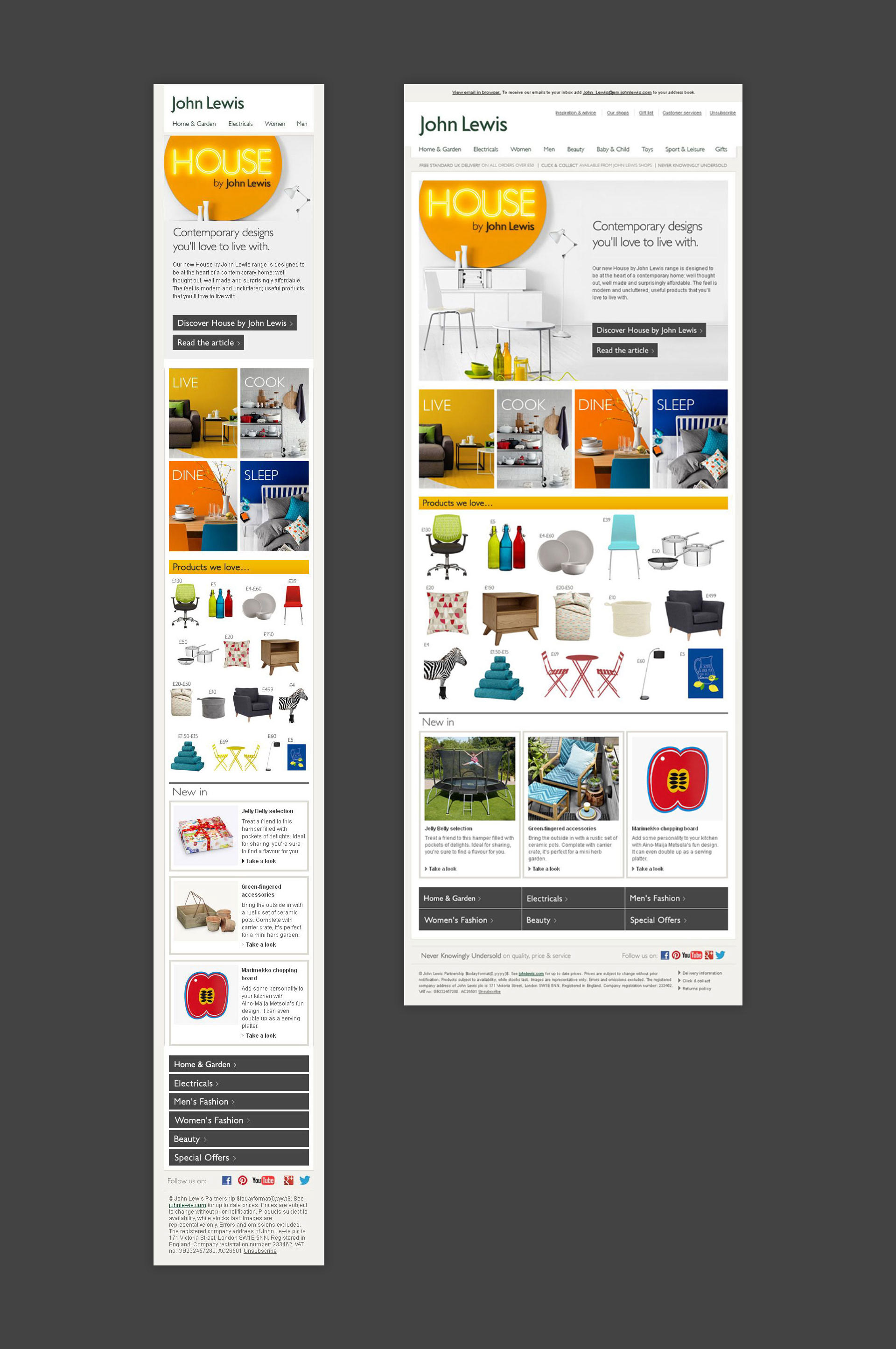
The design adhered to the brand guidelines and colour palette. It used a combination of lifestyle imagery and product cut outs to help inform the customer about the new product range and highlight some of the standout products. The email is responsive, meaning that the design changes depending on the size of device that the email is being viewed on. Below, we can see the mobile and desktop view. The email was built using HTML and CSS. It utilises CSS media queries to optimise the design depending on if the customer is using desktop or mobile device.
The design is split up into three sections. The first section is the hero which features a large lifestyle image and text that introduces the customer to the product range. The middle section consists of four blocks which acts as a visual overview of the four main sections and links through to their corresponding landing pages. The last section has an array of various product cutouts arranged in a less structured composition. The use of white space and the playful placement of the price helps to create a sense of intrigue.