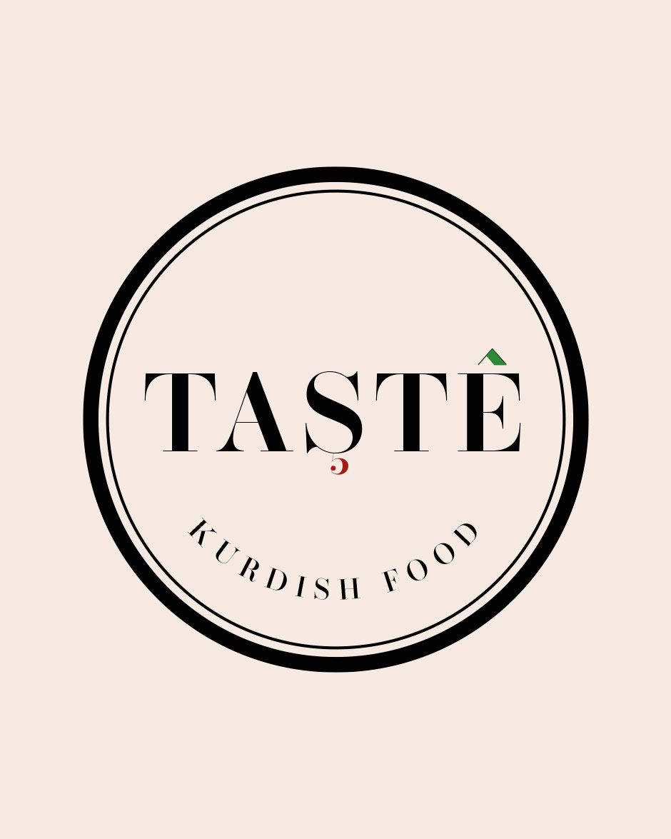
After multiple revisions and consultations, we got to the final design. The logo subtly pays homage to the beautiful Mountain ranges in Turkey where the owners family originate, through the green colour on the ascent above the letter 'E'. The red accent on the letter 'S' is the shape of a 5 as the company is owned by 5 sisters.
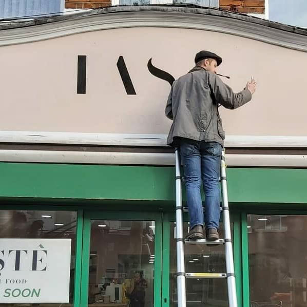
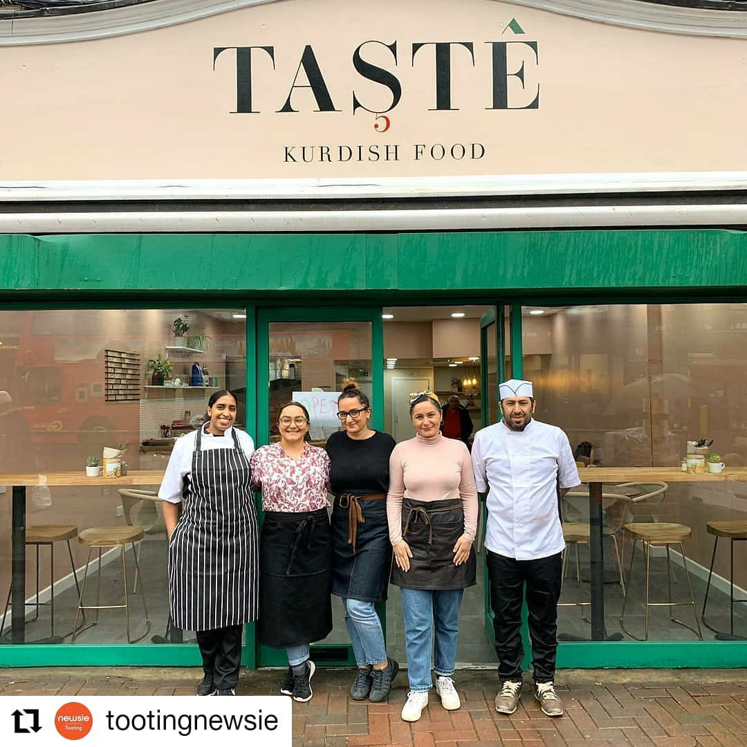
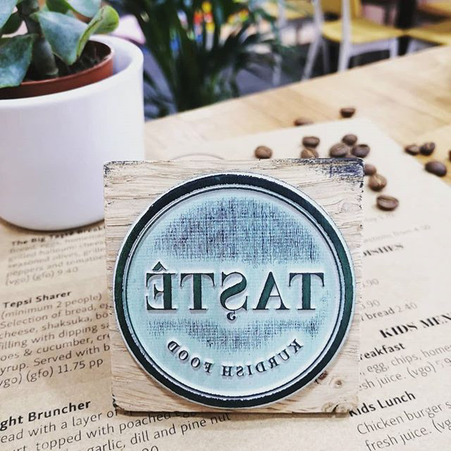
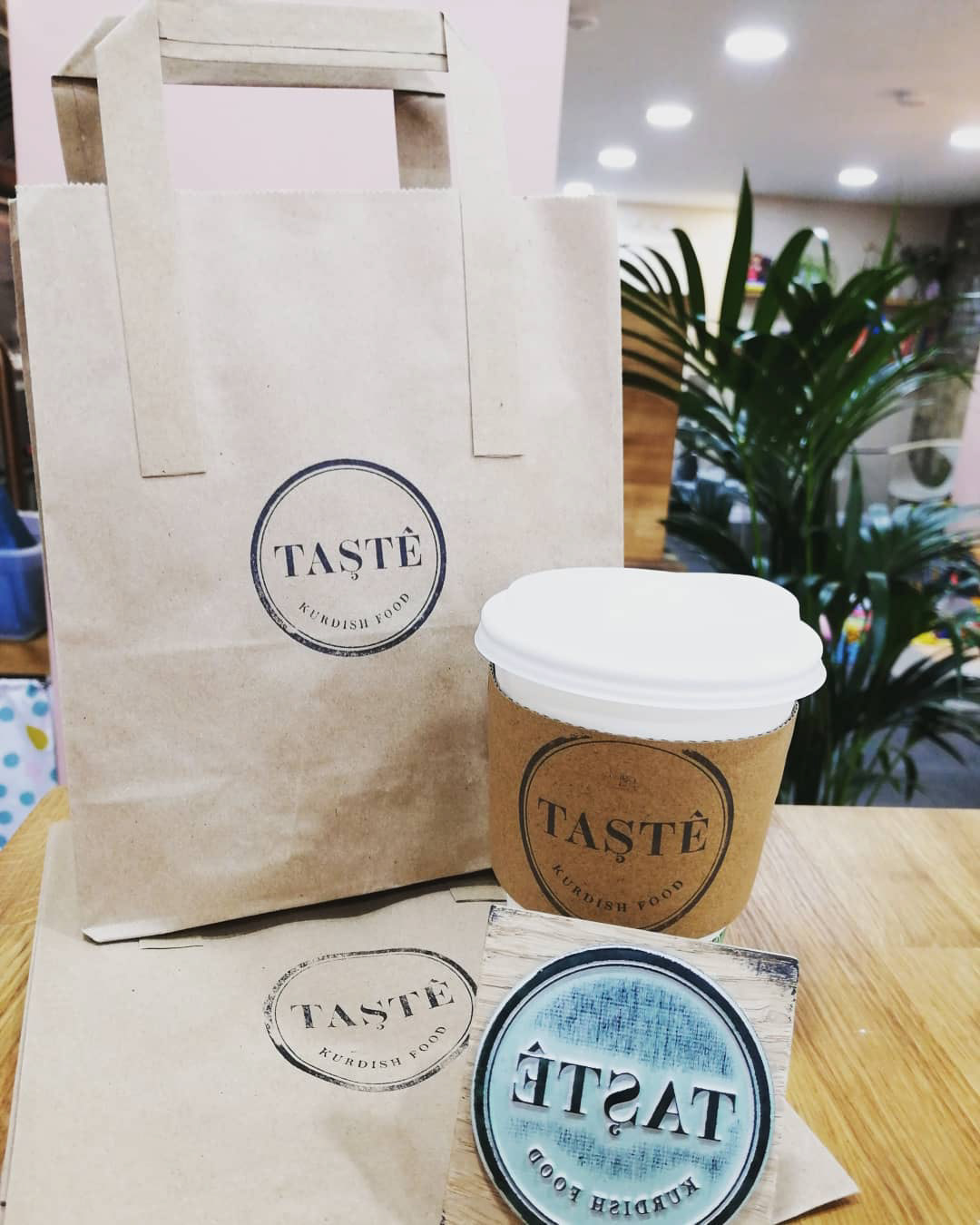
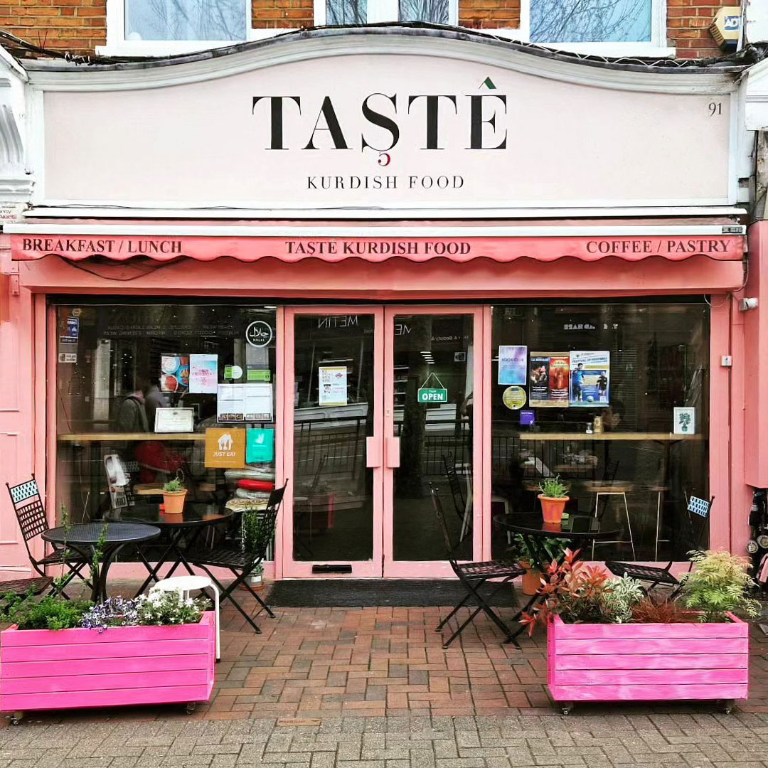
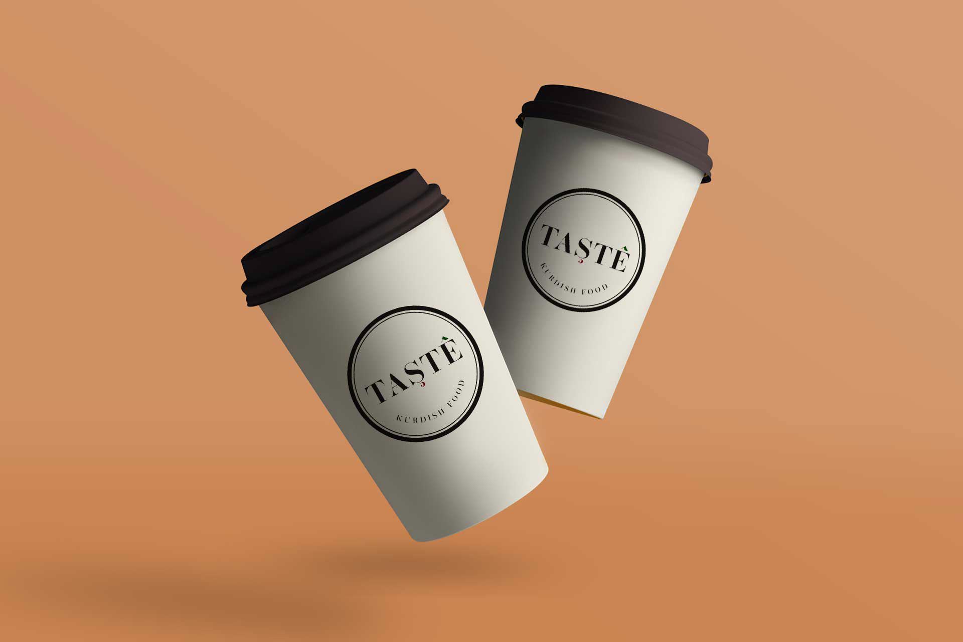
The design is encapsulated in a circle which works well when the logo is printed on a menu or stamped on a coffee cup. For the shop signage we removed the circle and opted to use just the text. As the shop front had a unique original feature, we thought it would be nice to have the logo hand printed onto the shop front.